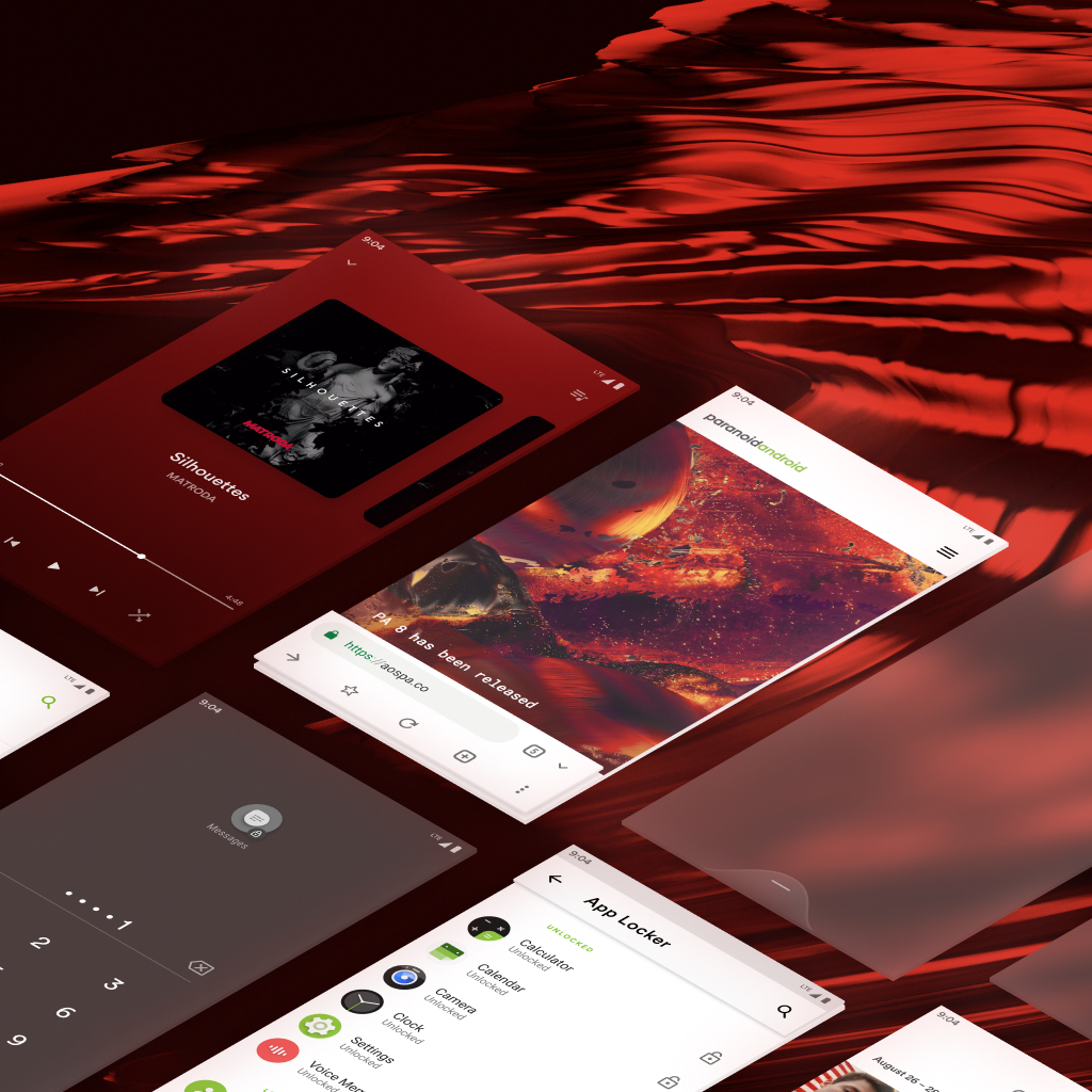
Paranoid Android
Development & Design
Paranoid Android is a custom ROM aiming to extend the system, working on enhancing the already existing beauty of Android and following the same design philosophies that were set forward by Google for Android Open Source Project.
Theme Engine - Q
Design
A feature meant to allow the user to compliment their device.
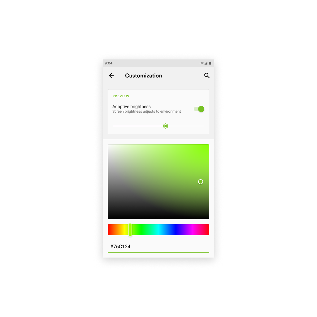
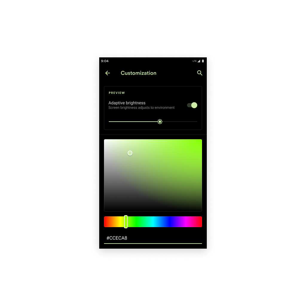

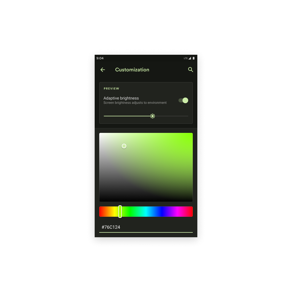


A user should feel connected with their device. After all, a lot see their phone as an extension to their hand, another limb. We want to reinforce this personal connection by making it more personal, selecting a color. A user shouldn't be limited to the system and the accent color in place. That is why in every PA version, we have offered a Theme Engine of sorts. This is the next step, this is Q.


Blink - Q
Design
An immersive navigation experience superior to that of Android Q or iOS
One of our designers, Espen Flagtvedt Olsen, came up with a very intuitive idea. Blink, a very fluid, straight forward, immersive gesture navigation system. That was P. Blink is still good, in the ideal sense, but now that we are in Q, we can step it up a notch. Curved with a subtle border, blurring the contents behind it, allowing the blink navigation to blend in with any app. With our ROM, we hold a philosophy that we only seek to enhance existing features and add in ones that feel like a natural step forward. This is that, but with our previous concept.
Keyguard - Q
Design
Your lockscreen - redefined.
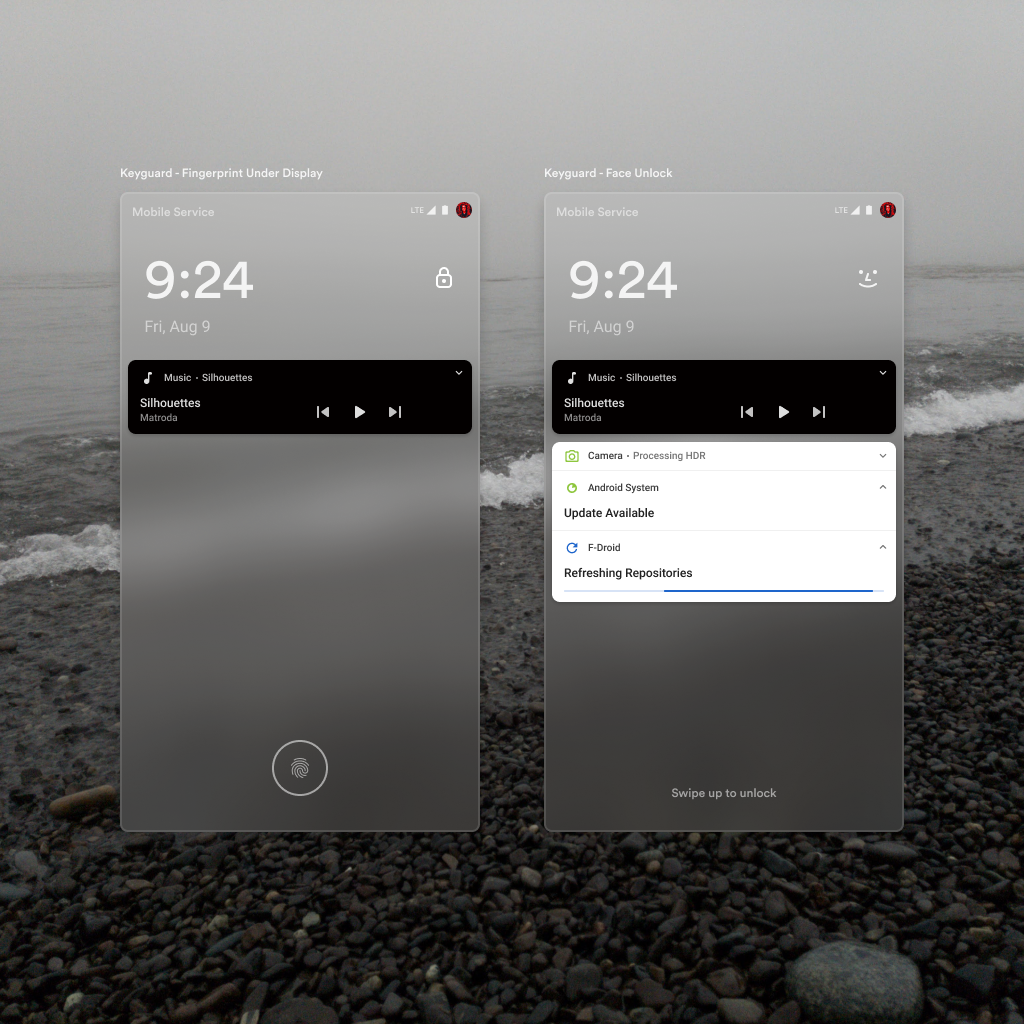
Keyguard has looked the same forever. I say it is time we make a change, enhancing the parts we love, adapting the layout for a more immersive experience, & taking advantage of new biometric locks. It is a chance to make the lockscreen we love more human.
Our journey starts with the clock. I decided to anchor it to the top left to enable more space for notifications & important messages. This would create a problem with the lock indicator which I've also decided to pair with the facial biometric lock icon.
Naturally, I put the indicator to the top right. This layout will maintain its scanability much like the last one, but in the end will create space.
I also made a slight enhancement to the notifications in terms of media playback. The idea is reused from iOS which in my opinion, does a really good job with handling media playback UI. I beleive that active media playback should be fixed at the top, and separated from other notifications for quick ability to control playback from the lockscreen.